Eleven print ads from the golden age of American advertising, turned into a homepage hero you can click. Twenty-seven of them, all moving. This is what carried over from 1967, what refused to, and the one constraint that shaped every decision.
What was already there
The hero was a mark, not a picture. The Rough Works mascot as a flat vector silhouette, and clicking him ran it through fifteen printed presses — flat ink, Ben-Day, line screen, terrazzo, out-of-register, fish-scale, a melt. One drawing, fifteen ways of printing it.
It was good, and it had a ceiling. Every press was a treatment of the same shape, so the fifteenth click told you nothing the third hadn't. What it needed was not more surface. It needed more subjects.
Eleven ads, handed over without a brief
No direction beyond I love these. Which is the most useful brief there is, because it leaves the job of working out why — and the why is where the design lives.
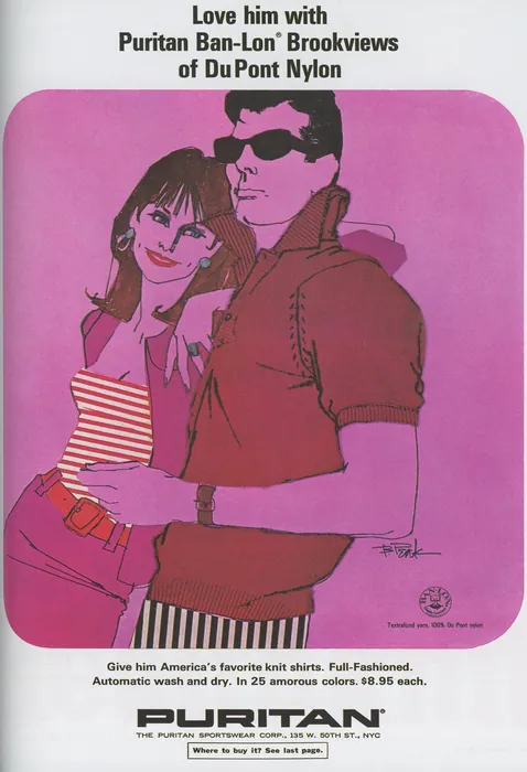
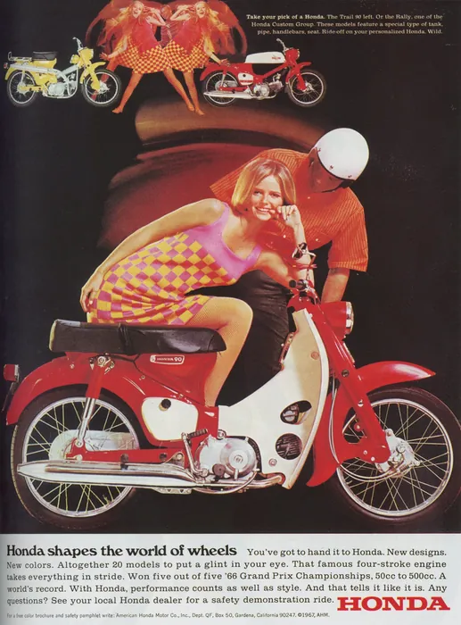
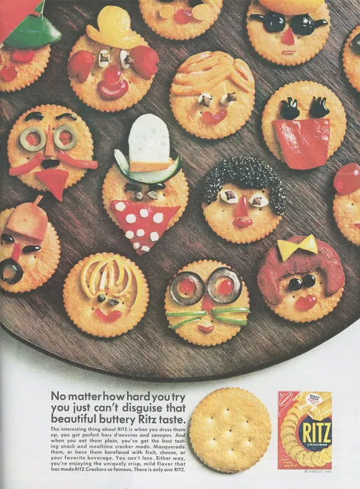
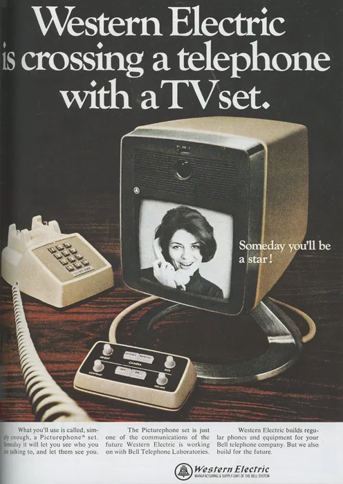
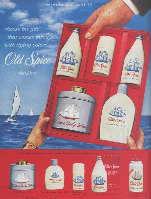
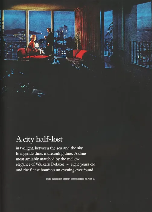
What a 1967 ad is actually made of
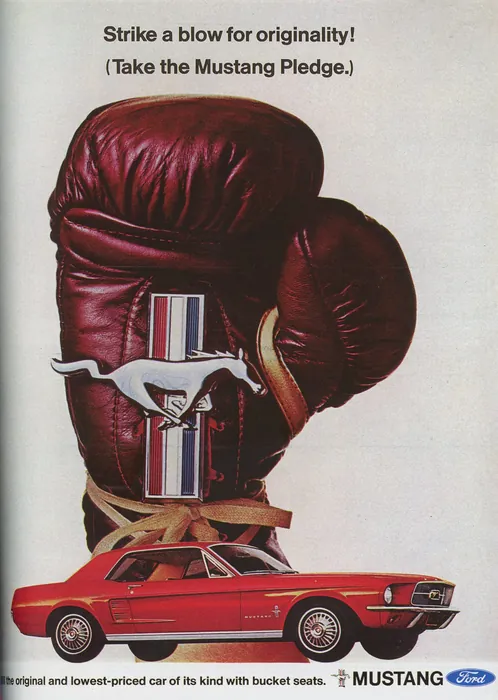
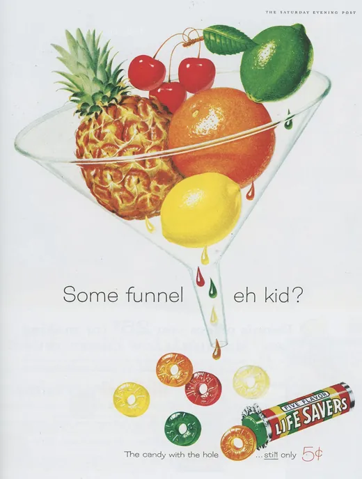
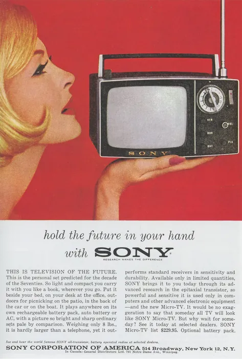
Look at the eleven together and the shared machinery is obvious. Every one is built on one idea, stated once, at scale. The Mustang ad is a boxing glove the height of the page and a car the size of a thumbnail. Western Electric spends its entire headline on a single sentence — crossing a telephone with a TV set — then simply photographs the thing. Life Savers stacks fruit in a cocktail glass and lets you find the punchline yourself.
They are also, structurally, the opposite of a web hero. They live on full-bleed colour and a paragraph of body type. A magenta field that runs to the trim. Four columns of copy under the image. Neither can cross over: a hero has its own background, its own headline, and no room for a hundred words of nylon-knitwear prose.
So what transfers is narrower than it looks, and worth naming precisely: the composition, and the gag. One object, monumental, doing one funny thing. The rest is scaffolding that belongs to paper.
The rule that shaped everything
One constraint, set at the start and never relaxed, which turned out to be the hardest part of the whole project.
Every plate has to sit on the page's own background — #EDE8D8, the warm off-white the site calls stucco — and be invisible doing it. No frame, no card, no shadow, and no hint of the artwork's own ground showing as a lighter or darker square. Nothing may touch an edge of the frame either, or the figure reads as cropped the moment it lands in the panel.
It sounds like a finishing note. It is the spec that governs the artwork, the file format, the encode and the CSS.
Four ads, four plates
The scans below have a hard edge and a drop shadow, because they are photographs of paper. The plates beside them have neither — they are printed on this page's own ground, which is the entire trick.
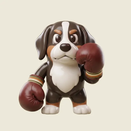
The Pledge
The scale is the idea. He is not holding a prop, he is the hero object — chin down, set, shot from below. Cuffs banded in cream, orange and olive so the palette lives on the object instead of the ground.
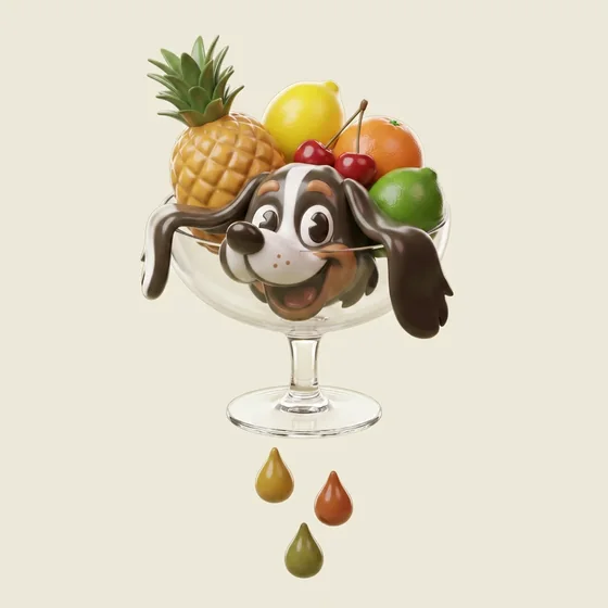
Some Funnel
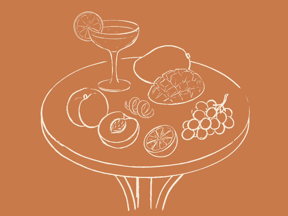
The still-life rebuilt as a toy, with him in the bowl instead of the pineapple. Three drops fall clear of the foot so the gag still lands.
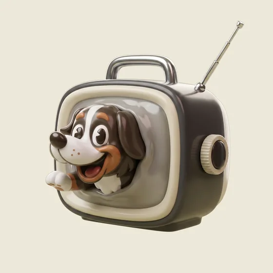
Micro-Teddy
The 1962 set built as a vinyl object — and then he comes out through the glass, muzzle and one paw pushing the screen forward. For a studio that sells websites, the thing climbing out of the screen is the second read.
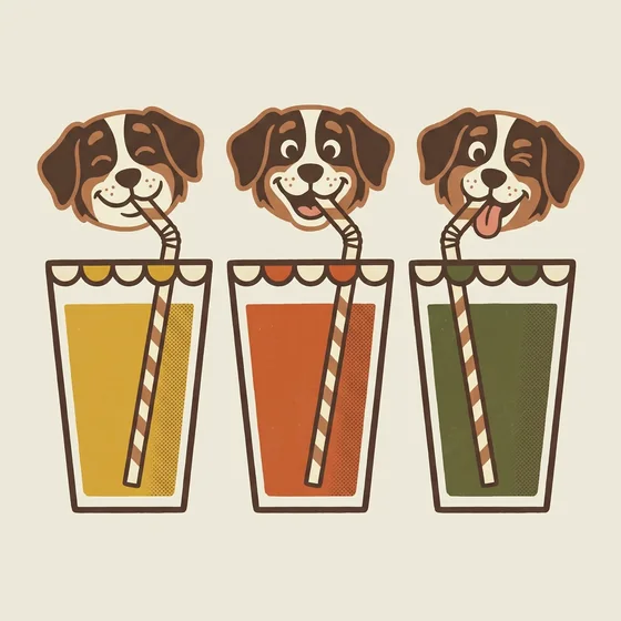
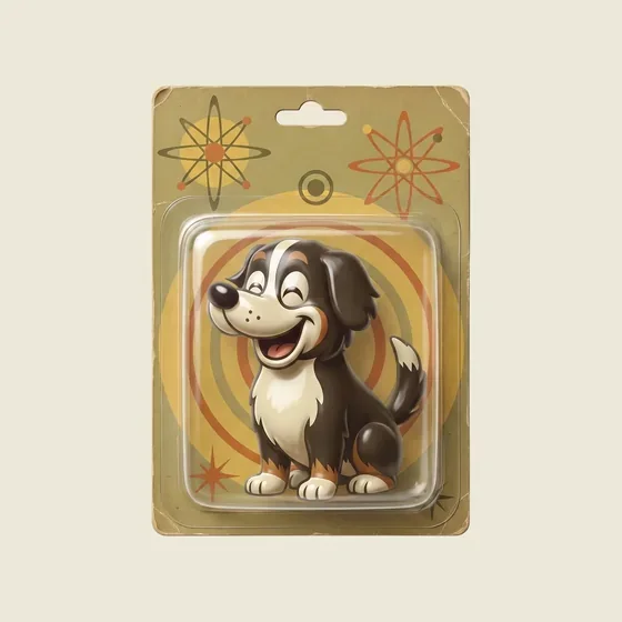
Three Flavours
The only one of the four with no 3D in it at all. Flat colour, thick warm outline, halftone dots. This is the one that won, and everything after it came from here.
The one that wasn't 3D
Three of the first four were glossy dimensional objects — the safe direction. The fourth was flat gouache with a thick warm outline and visible halftone dots, taken from a 1964 Nestlé's Keen ad. It was the outlier, and it was the one that landed.
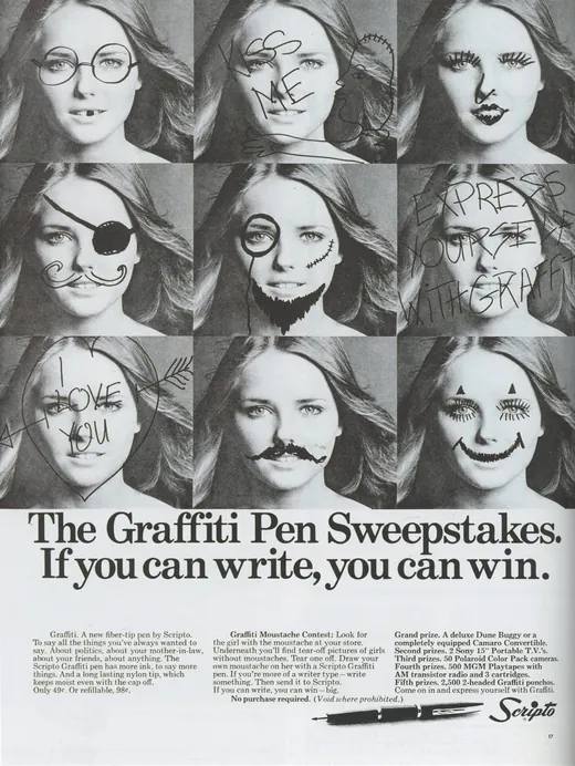
So the next run went that way: seven more painted plates pulled from the remaining ads, and three that read better as objects and stayed moulded. The Scripto ad — a grid of one face defaced nine ways — turned out to be about the same thing the clicker is about, and became the strongest plate in the set.
Painted
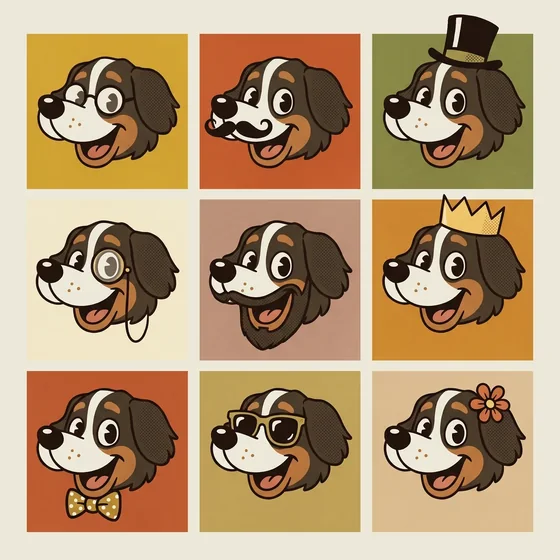
The Doodles
Scripto, 1969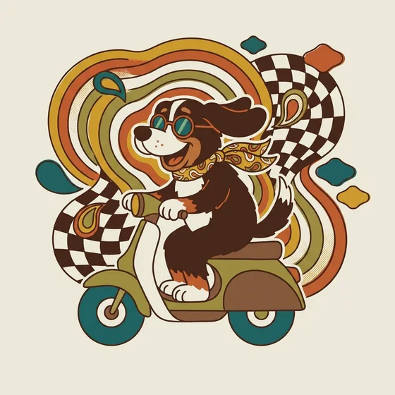
The Wheels
Honda 90, 1967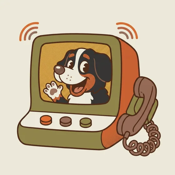
The Picturephone
Western Electric, 1968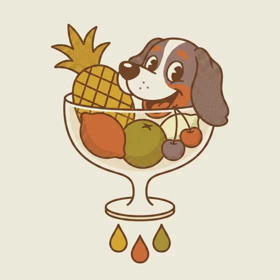
Some Funnel, flat
Life Savers, 1960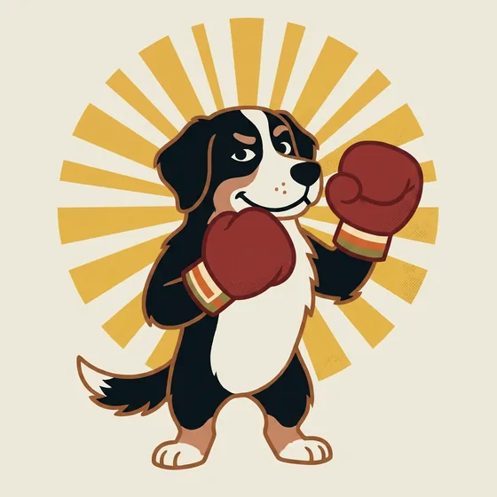
The Pledge, flat
Ford Mustang, 1967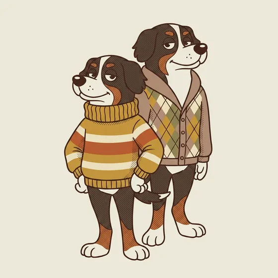
The Knitwear
Puritan, 1965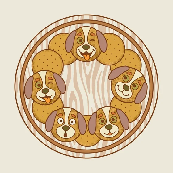
The Snack Tray
Nabisco Ritz, 1968Moulded
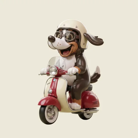
The Scooter
Honda 90, 1967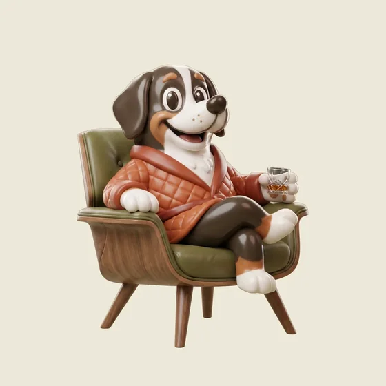
The Nightcap
Walker’s, 1962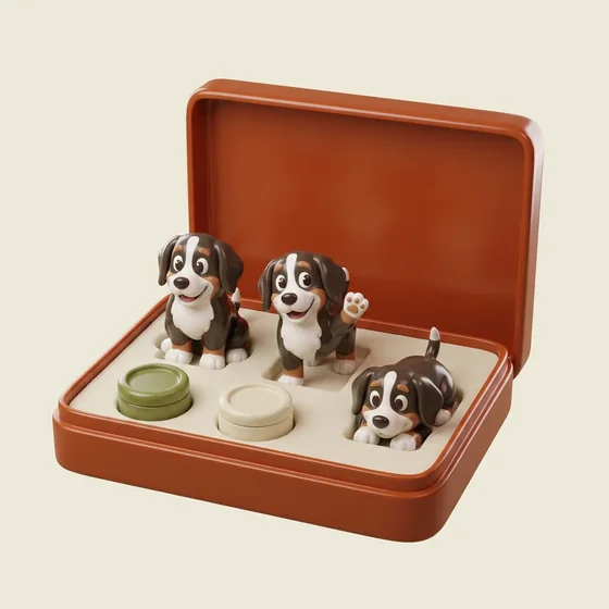
The Gift Set
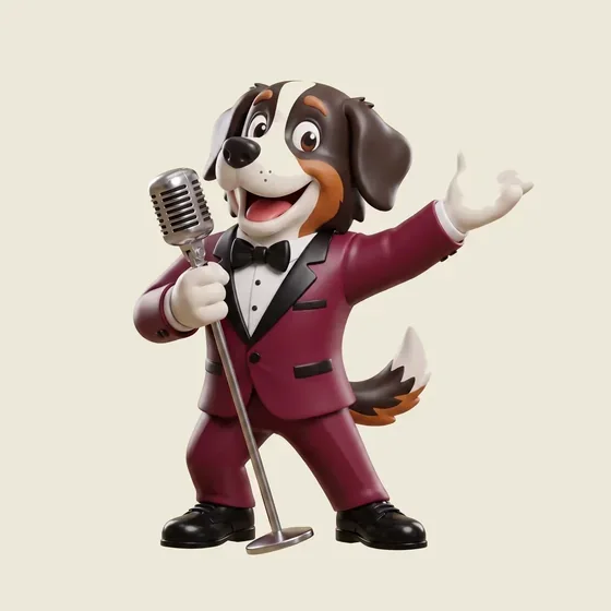
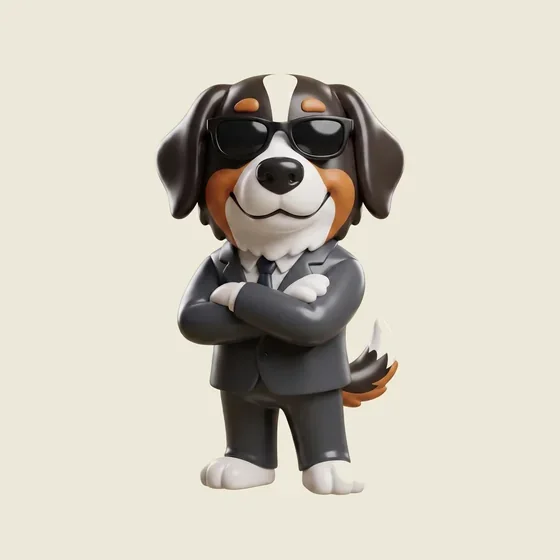
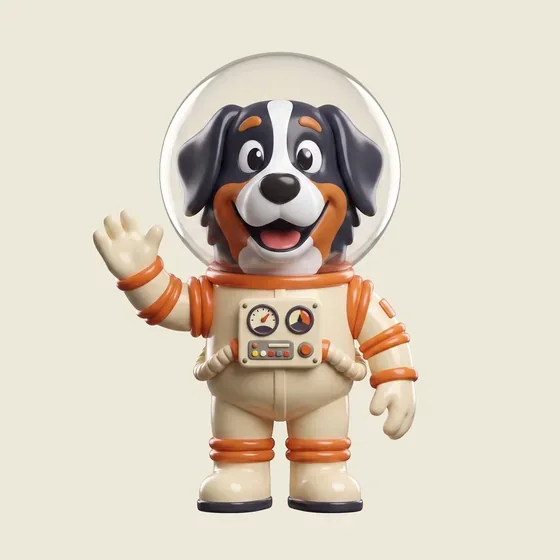
Old Spice, 1960And the figures already in the deck
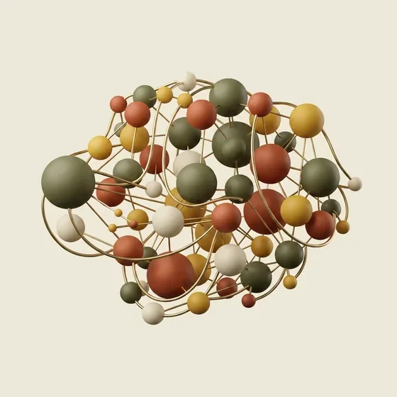
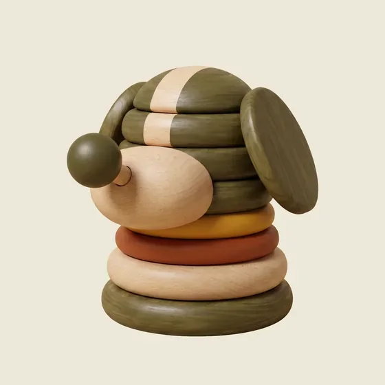
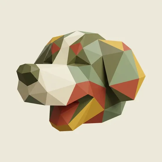
Making them move
Twenty-seven figures, one gesture each, and rules strict enough that nothing looks like stock motion.
The camera never moves. The ground never changes. The figure never travels, never leaves frame, never changes scale. What is left is one small idea per clip: the Scooter is just his ears streaming in the wind. Soul sways from the hips while the microphone stays nailed down. The molecule makes one slow revolution, like a museum turntable.
Each clip runs three and a half seconds forward, then the same three and a half backwards — the reverse is cut into the file itself, so ordinary loop playback runs it out and back forever with no seam. Two had to be rethought when a full rotation swung a sculpture onto the bottom edge, and a low-poly head turned side-on into a featureless slab.
Matching one colour, in two browsers
Here is the part that took longest, and it had nothing to do with taste.
A flat cream rectangle in a video is not the same flat cream as the CSS behind it — not reliably, and not across browsers. Video files carry colour metadata describing how their numbers should be interpreted, and when that metadata is missing, every browser is free to guess. They do not all guess alike. Chrome landed on the page colour exactly. Safari painted the same clip at #EFEBDC against a page of #EDE8D8 — off by two, three and four levels, which sounds like nothing and reads on screen as a visible rectangle.
The fix is not the obvious one. Tagging the files BT.709 — the standard most video carries — changes nothing, because BT.709 and sRGB share primaries but not the transfer curve. A browser honouring BT.709 lifts a cream by exactly the same amount.
Tag the transfer as the sRGB curve — the one CSS colours already use — and it lands inside a single level, tighter than the still images beside it.
There is a smaller cousin of this in the stills, and it is unfixable rather than unfixed. Lossy WebP cannot represent #EDE8D8 at all: it is not a fixed point of the RGB-to-YUV round trip and always decodes one level down. Lossless holds it exactly, at eight to ten times the file size, which is the wrong trade for a hero.
Two colours can be identical in the file and different on the screen. The only test that counts is the one run in the browser people actually use.
The party
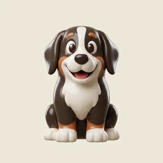
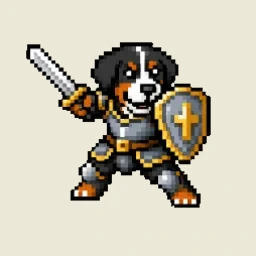
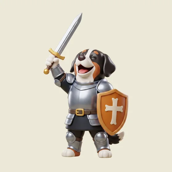
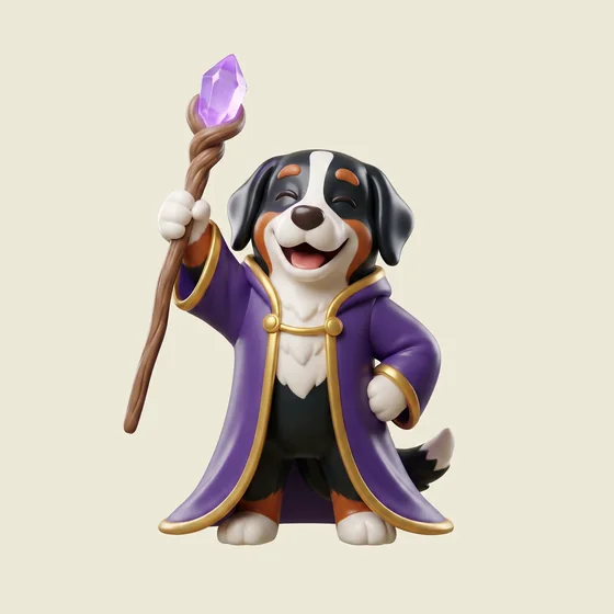
Rough Works has a pixel-art roguelike, Berner Crawl, with three playable dogs. They were already in the hero as sprites. They came back as figurines.
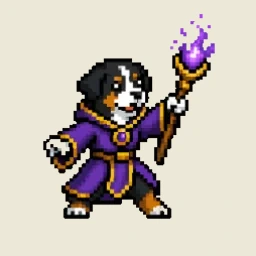
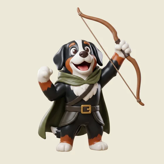
Each was built from its own game sprite, so the armour, the robe trim and the markings carry across rather than being invented — the sprite sits beside each pair below for exactly that reason. Two poses each: one attacking, one triumphant, and the triumphant ones dance.
Teddy
The Knight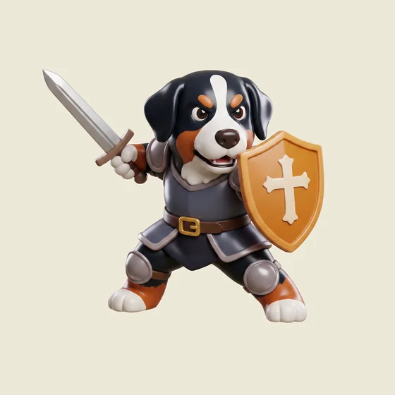
Gabby
The Mage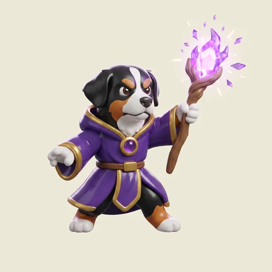
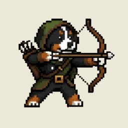
Moose
The Ranger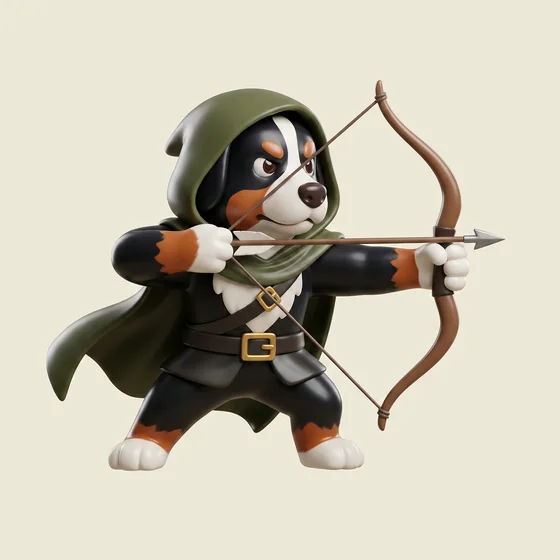
One of these needed a fix worth writing down. Gabby's spell was lighting up the stucco around her — a violet haze spreading across the ground, invisible to any check that only samples edges and corners.
What made it removable was a small piece of physics: a glow makes the ground lighter, a contact shadow makes it darker. On the offending clip that split 2,491 lighter pixels against 86 darker ones. Flood-fill the region connected to the frame border, keep only what is lighter than the ground, flatten that — and the haze goes while every pixel of the figure's own shading stays.
And a reward for anyone who clicks through all of it
The deck deals every press exactly once before it reshuffles, which means “the end” has a definition you can actually reach. See all twenty-seven and the next click hands back a fullscreen takeover instead of a twenty-eighth: the three of them head-banging under three spinning disco balls, on pure black, for fifteen seconds at 2K.
Black is the correct exception. Every other asset in the hero is a plate sitting on the page, so it has a ground to match and a seam to give away. This one covers the whole viewport — there is no page left to match, so the rule has nothing to govern.
What shipped
Twenty-seven presses, every one a film. The scooter greets you at load and the deck shuffles after that, dealing each press once per pass and never putting two of the same kind back to back — which needed the figures split into two families when the static plates came out, because one theme holding more than half the deck makes that rule arithmetically impossible rather than merely difficult.
The fifteen printed presses of the mascot head are retired. Their CSS is still in the file and still works; bringing one back is a single row in a table.
The short version
What carried over from 1967 was never the layout. It was the discipline: one idea, stated once, at scale, with a joke in it. The rest — the full-bleed colour, the four columns of body type — belongs to paper, and trying to bring it across is how you end up with a website that looks like a scanned magazine.
Keep reading
- Claude Design walkthrough: great tool, not a designer
- Berner Crawl v2: what AI tools still can't do in art
Work with Rough Works
Need a partner for your next site? We're a Vancouver-based digital agency building websites and AI-enhanced experiences for brands across Canada and the United States. Start a project →