
RoughWorks
& Sprizzini
Name to nav bar — wordmark, palette, icon set, packaging, art direction,
the site and everything moving on it — all Rough Works.
Now playing ·
A Drink You Can’t Taste Through a Screen
Overview
Sprizzini is cocktail-bar quality on tap — real spirits, real fruit, real bitters and real botanicals, poured into a cup you can carry out of the bar. When it reached us it was a name and an idea. No wordmark, no palette, no icons, no packaging, no photography and no website.
A drinks brand has a specific problem: the product is a taste, and a screen has none. Everything a good bar does to sell a spritz — the colour of it, the noise around it, the person handing it over — has to be rebuilt out of type, colour and motion. And whatever we drew had to survive being printed on a cup, stencilled on a tap badge, pinned to a menu board and rendered at sixteen pixels.
Nothing existed yet
No mark, no palette, no icon set, no packaging, no site. Every decision would set the shape of the next one, so the first ones had to be right.
The product is a flavour
You cannot taste a screen. Colour, type and motion had to carry what a bartender normally carries by handing you the glass.
It has to hold at every size
The same identity had to work printed on a cup, cut into a tap badge, chalked on a board and drawn at favicon scale without turning to mush.
Five pours, one brand
Each cocktail wanted its own colour and its own character. None of them was allowed to fracture the thing they all belong to.
Two Pop Shoulders
We stood the identity on two people. Eduardo Paolozzi — the Scottish-Italian collagist — gives the wordmark its voice: ultra-heavy titling set so tight the letters nearly touch, carrying a composition on its own. Sir Peter Blake gives the icons theirs: flat, hard-edged badge geometry in saturated fields. Out of that came six flat colours with no gradient anywhere, a sixteen-mark set of citrus slices and bubbles drawn thick enough to hold at favicon scale, packaging where one icon carries one label, and a rule we never broke — one colour and one icon per surface. The site is that same system put in motion: eight pages of static HTML on a self-hosted GSAP stack, where the drawings turn, the colour fields wipe, and every pour gets a page of its own.
Four Tables, Turning
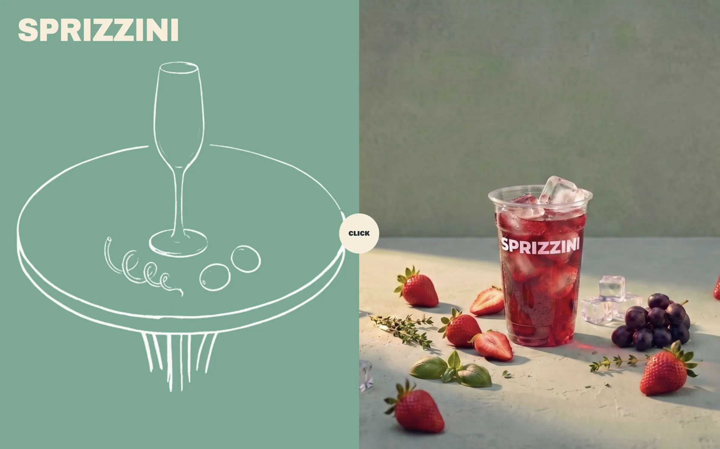
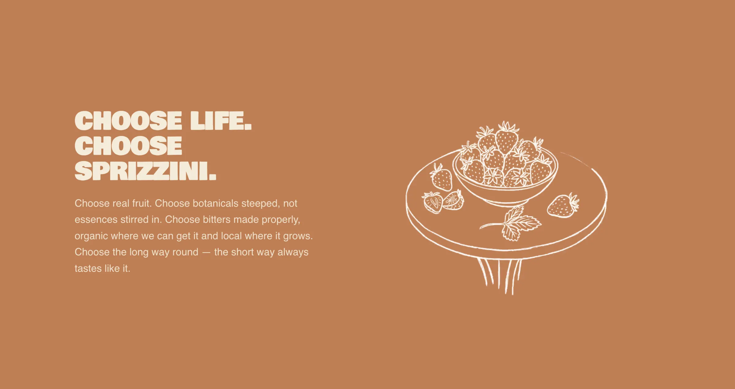
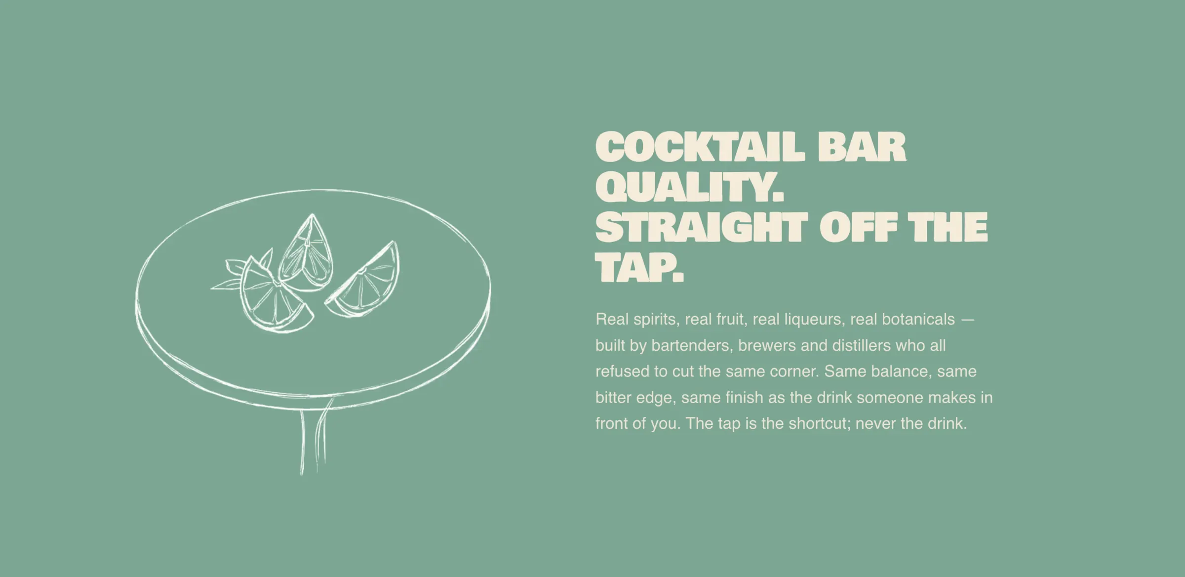
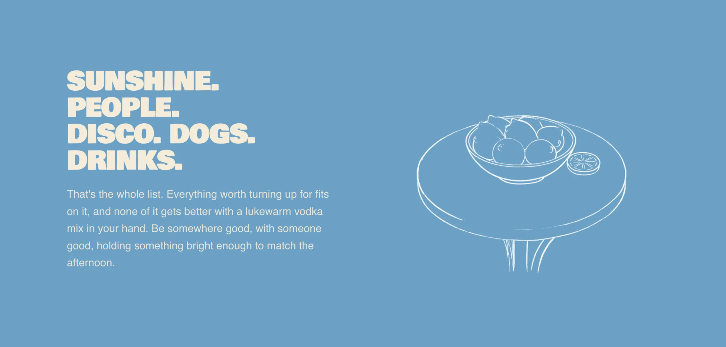
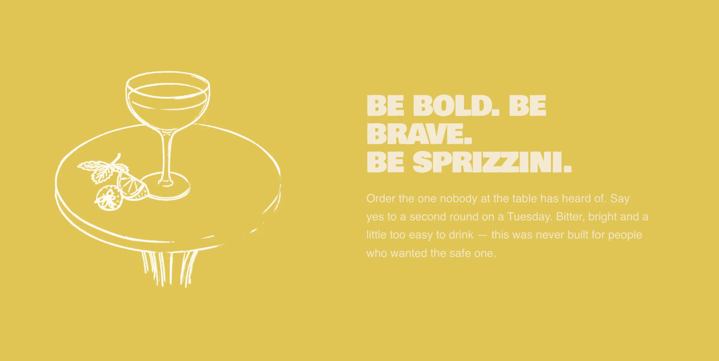
Every fruit on the site was drawn by hand as loose contour line-work, then turned on a rig and rendered a frame at a time. These are the real clips off sprizzini.com, scrubbing to your scroll — white lines on black, blended so the black becomes the colour field behind it.
Archivo Black, tracked to −5.5%
The wordmark is set in Archivo Black, all caps, tracking pulled to −5.5% and the letters stretched to 118% wide by 115% tall so they sit heavy and nearly touch. It is the only thing on most surfaces, which is the point — Paolozzi’s titling carried a composition by itself, and this has to do the same on a cup you are holding at arm’s length.
Six colours, one per surface
Stucco, Lemon, Terracotta, Sea, Sky and Slate. Flat fields only, hard edges, no gradient anywhere and never on type. The manifesto scrolls straight through four of them, each panel one solid colour with one line drawing on it, so the palette is taught by using it rather than by a swatch page nobody reads.
Five cocktails, five pages
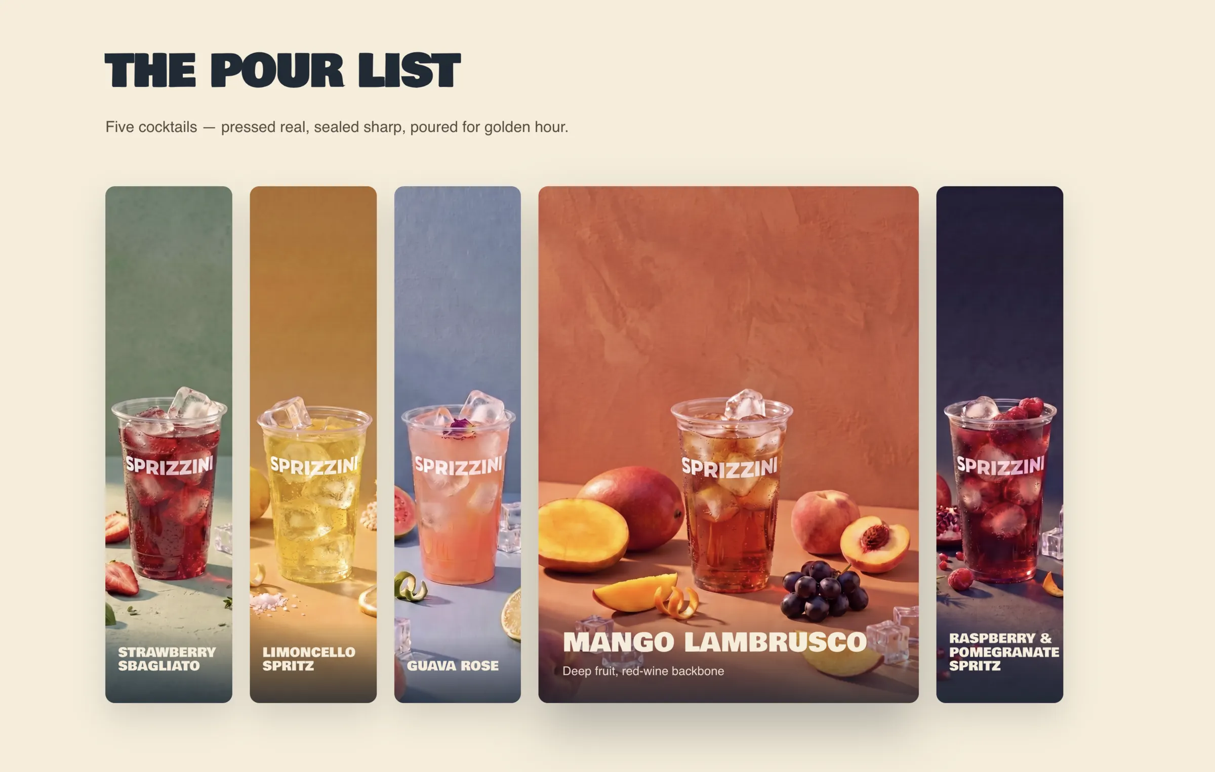
Strawberry Sbagliato, Limoncello Spritz, Guava Rose, Mango Lambrusco and the Raspberry & Pomegranate Spritz each get a colour, a card in the pour list and a page of their own — opened by tapping the card, and laid out as a horizontal walk through every ingredient by hand.
A brand is no good if nobody can find it
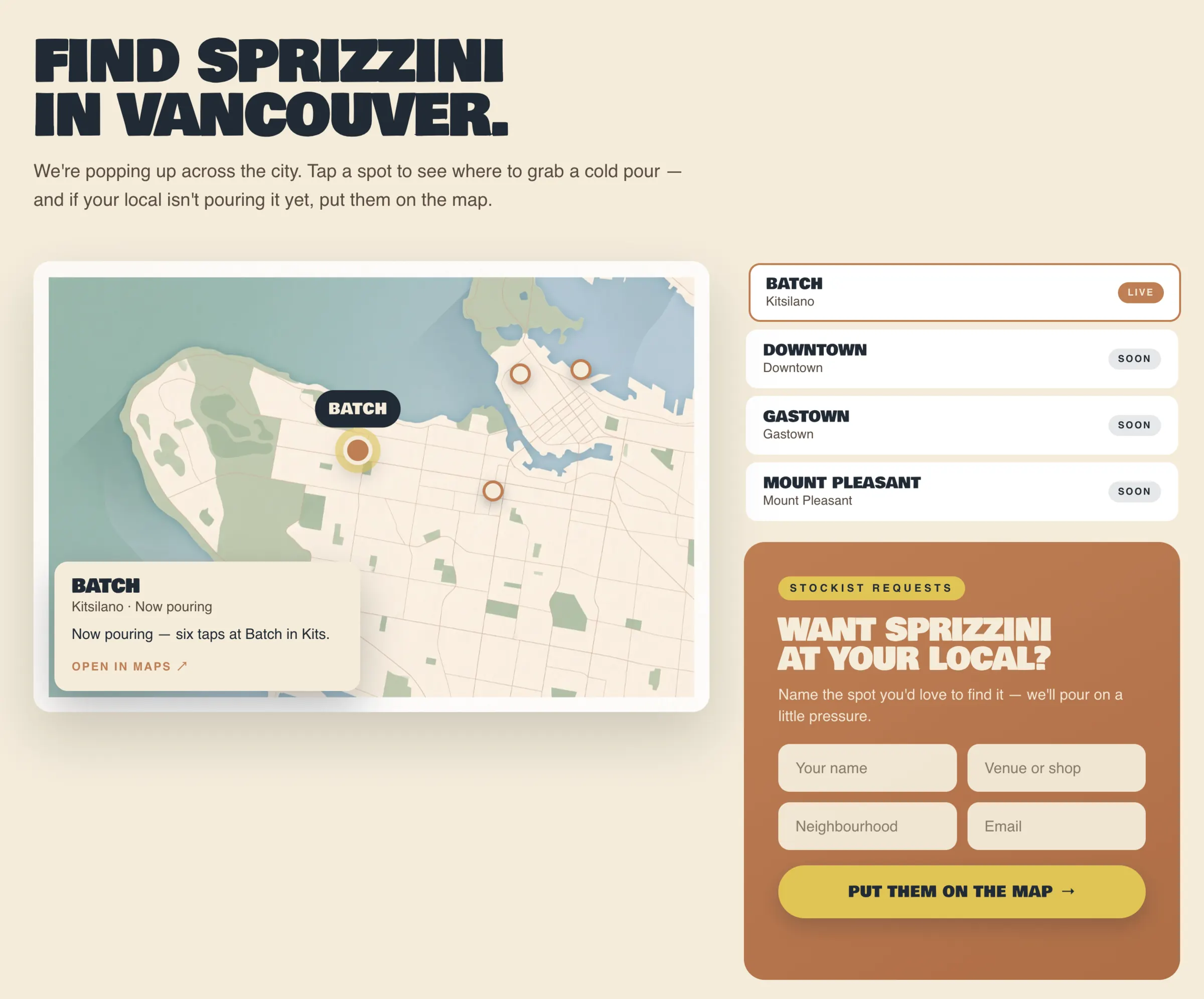
The last section is a map of Vancouver with the taps on it — live at Batch in Kitsilano, coming to Downtown, Gastown and Mount Pleasant. If your local isn’t pouring it, there is a form to put them on the map. It is the least glamorous part of the site and the one most likely to sell a drink.
A Whole Brand, and Somewhere to Drink It
Everything, and it all came out of one system
A wordmark, a six-colour palette, a sixteen-mark icon set, packaging for the core range and an abstract series, social templates, tap and menu artwork, art direction for the photography, and an eight-page website. One set of rules underneath all of it, so the mark on a tap badge and the mark on a favicon are recognisably the same decision.
The site is live at sprizzini.com — and the drink is live at Batch in Kitsilano.
One system, every surface
Wordmark, sixteen icons, six colours, packaging, social templates and the site all resolve from the same rules — flat fields, hard edges, one colour and one icon per surface.
Eight pages, all live
Home, explore, the perfect-pour game and a page for each of the five cocktails. Every one of them answering on the live domain.
GSAP, self-hosted, no CDN
GSAP with ScrollTrigger, SplitText, Draggable and InertiaPlugin plus a horizontal-loop helper — 196 KB of JavaScript served from the site’s own origin rather than borrowed from someone else’s.
65 clips and 230 images
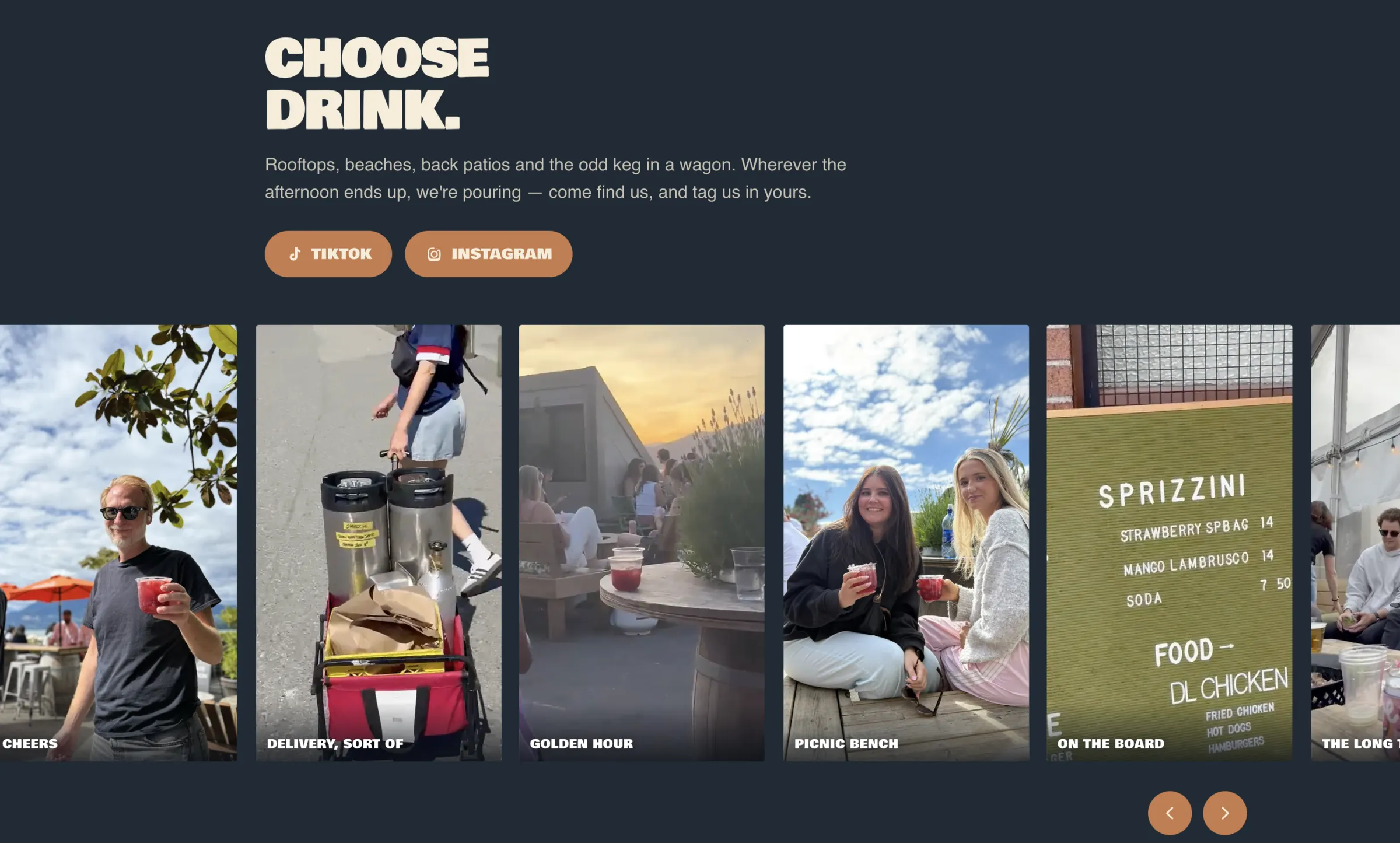
Every drawing, turntable, still and lifestyle frame on the site was art-directed and produced in-house — including the hand-drawn line-art tables that turn as you scroll.
The Brand, Running
Let's Build
Something Great
Not sure where your own site stands? We’ll send back a free teardown inside two business days — what’s slow, what Google can’t see, and how your store reads next to two competitors on the same shelf.
Free · 48-hour turnaround · no call required
 Beverage Brands
 Consumer Brands